Zafco
An intelligent customer support platform for agents to resolve customer tickets with efficiency and minimum errors.
00

Zafco International is one of the region's largest tyre distributors. Their consumer brand, TireStreets, runs thousands of orders a month, same-day fulfilment, complex fitment queries with customers who can't wait when something goes wrong.
When something goes wrong; wrong tyres delivered, a shipment going missing, a return request, a customer writes in. And a support agent has to figure it out.
That's the product I was asked to design. A support portal for the agents who handle these complaints.
Sounds simple, right?
Let's look at what actually happens when an agent opens a ticket.
The situation: five tools, one ticket, zero connection.
Before this portal, agents juggled Zendesk, Dropbox, Ginesys, ChatGPT, and a custom ERP. Switching between all five to resolve a single customer ticket.
Tools | Role |
|---|---|
Gorgias | Open ticket, read the complaint, look at the photos the customer sent. |
Shopify | Pull up the original order, check what was supposed to be delivered. |
Odoo | Check if the correct tyre is in stock, which warehouse has it, when it restocks/not. |
FedEx | Generate a return label. |
Shopify | Create replacement order. |
ChatGPT | Draft a reply to send to the customer. |
Gorgias | Update the ticket. |
THE RESULT
Skipped verification steps. Inconsistent resolutions. Tickets dragging for days. Not because the agents weren't good at their jobs but because the tools were never designed to work together.
The tools weren't broken. The gap between them was.
The design problem
You might be thinking: just put everything in one place. Give agents a unified dashboard. Done.
That's a perfectly reasonable assumption. But it misses the harder part.
The problem wasn't just that information lived in different tools. It was that agents had to be the orchestrator. They had to decide which flow applied to which complaint. They had to know the right order of steps. They had to remember what to verify before what. They had to carry the entire process in their head, every time, for every ticket, whether they were a senior agent or someone in their first week.
THE BRIEF
"Build us a Single Pane of Glass. One place. Everything the agent needs to resolve any ticket without opening another tab."
That's what we were building. Not just a consolidated view. A portal that does the thinking and hands the agent only what needs a human decision.
The principle behind this: Don Norman said it best: "Machines should work for humans, humans should not adapt to machines." The old setup had it backwards. Agents were adapting to five different machines, every single ticket.
Designing the portal.
Before I got to screens, I watched the agents work. I reviewed recorded stakeholder sessions, first pass to understand, second pass to map, third pass to mark friction. I traced the exact path an agent takes, step by step, for each of the eight complaint types.
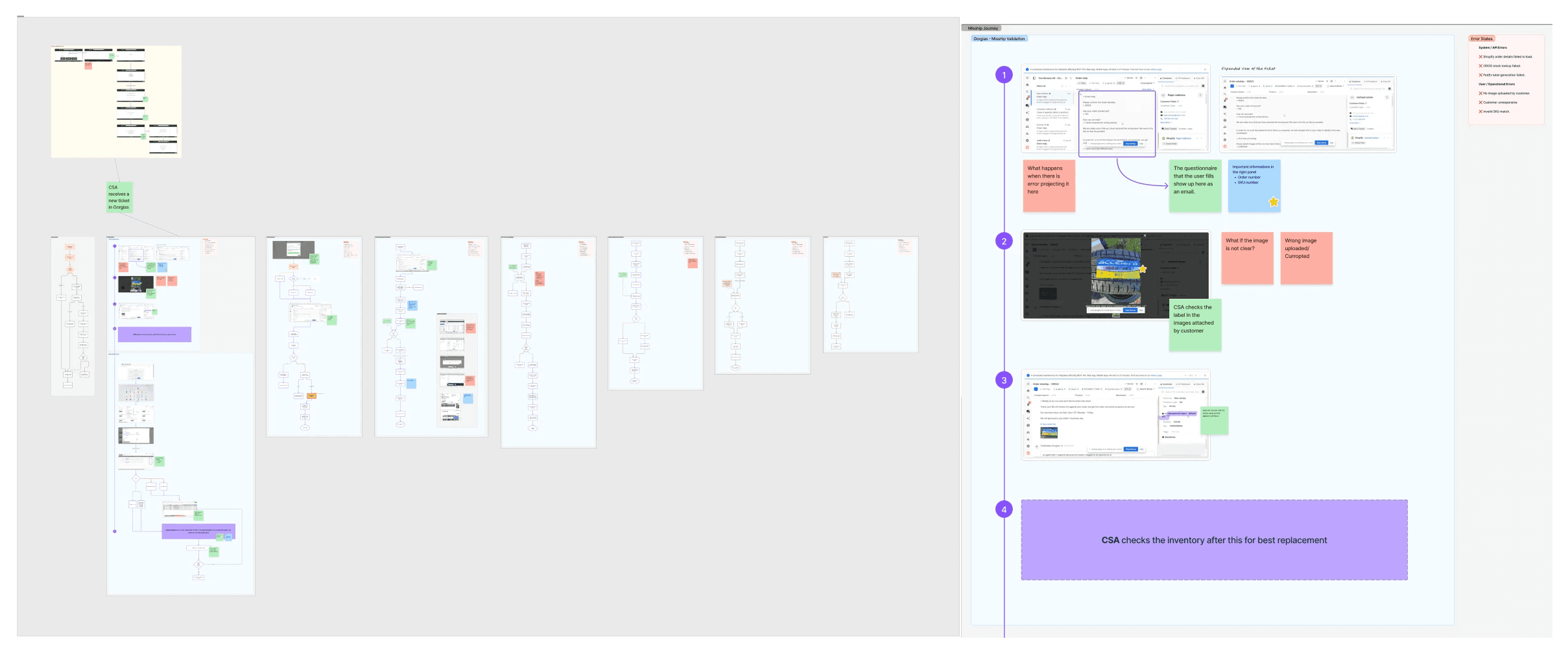
Here's what I found, and what I did about it.
Take 1: The portal should decide the flow, not the agent.
In the old setup, an agent opened a ticket and faced a blank page. Which resolution type is this? What are the steps? What needs to happen first?
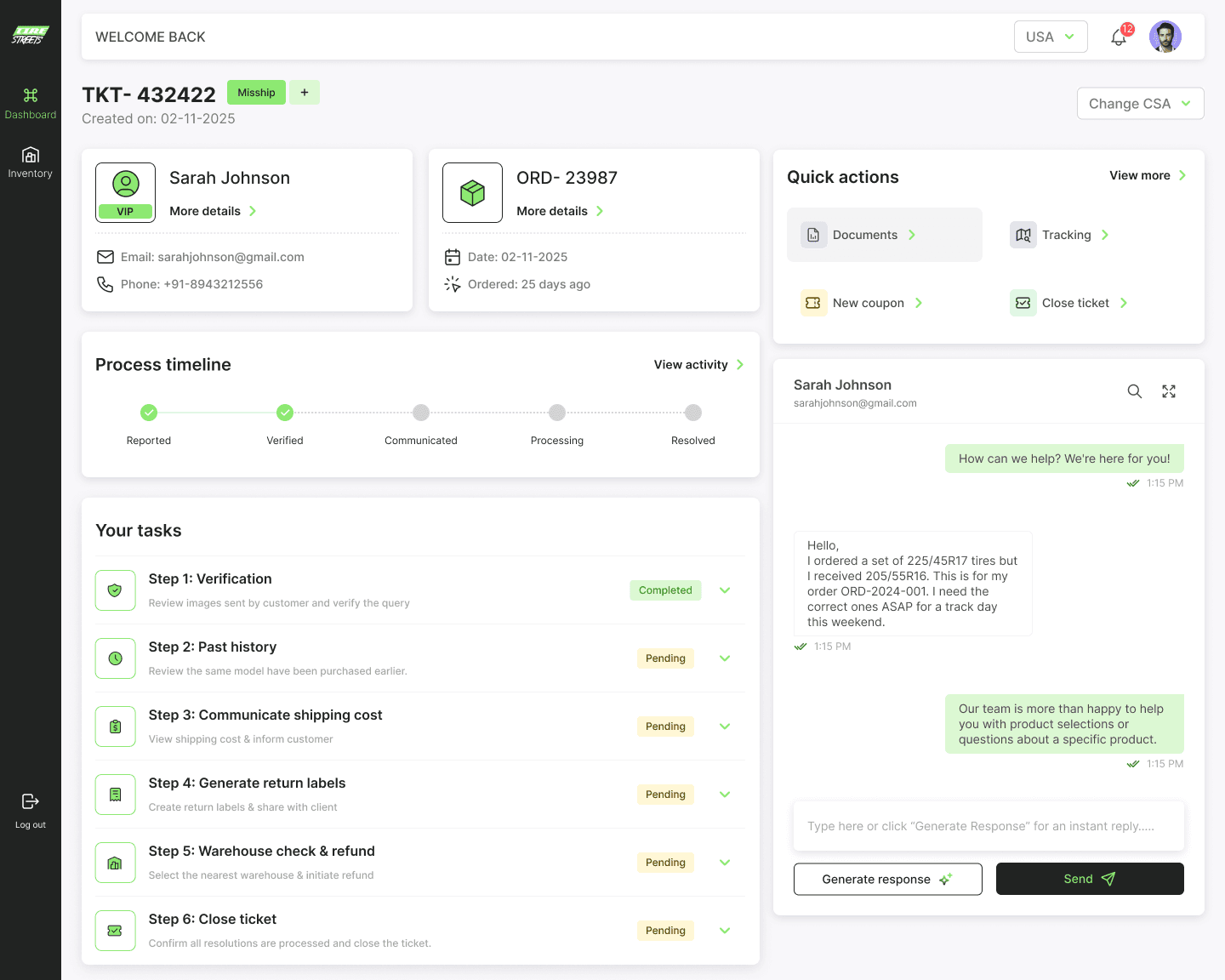
The first decision I made: the portal reads the ticket and lays out the steps automatically. Sequential. Locked. You can't move to step 2 until step 1 is done.
The interface became the training manual. A new agent on their first week would follow the same process as a senior agent with two years of experience. The consistency wasn't enforced by management, it was built into the design.
WHY THIS MATTERS
The most common failure in support workflows isn't laziness, it's step-skipping under pressure. When a ticket queue is long and a customer is angry, agents cut corners. Sequential locking removes the option.
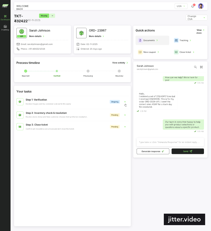
Take 2: The information agents need should live inside the ticket, not in another tab.
Every time an agent needed to check stock, they opened Odoo. Searched for the SKU. Noted the count. Closed the tab. Came back to the ticket. If there were three SKUs, they did this three times.
What if the stock data just… appeared? Inside the resolution step, automatically, right next to the item in question?
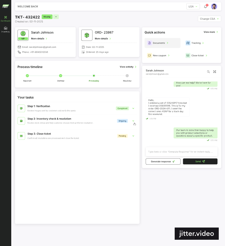
That's what we built. Real-time Odoo inventory data; stock, restock dates, warehouse location, surfaced inline inside the resolution step. The agent never leaves the ticket.
Take 3: Let the system pick the warehouse. The agent just confirms.
Choosing which warehouse to ship from was a judgment call. Nearest? Cheapest? Which one has the item in stock? Agents were doing this math in their head, every time.
The portal now ranks warehouses automatically, by cost and distance and pre-selects the best option. The agent sees the recommendation and the alternatives. One click to confirm.
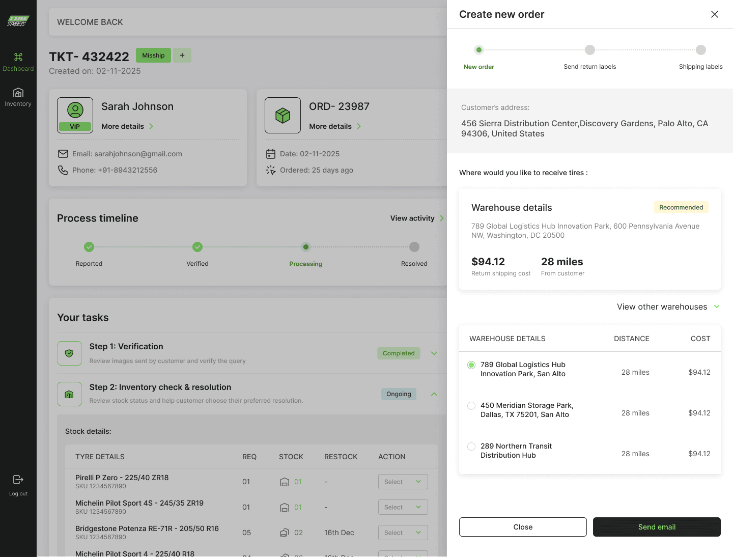
One less decision under pressure. Every time.
Take 4: Show return eligibility before the agent even asks.
TireStreets has a 30-day return window for mounted tyres. Every time a return request came in, the agent manually checked the order date and did the math.
Is this still within 30 days? What's today's date? When was the purchase date? Let me calculate...
Now, a "3 days left" badge appears on the ticket the moment it opens. The agent knows the window is closing before they've read the complaint.
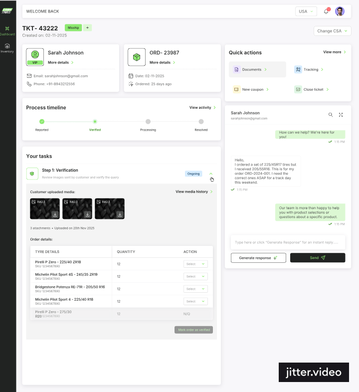
No date math. No second-guessing. The information is proactive, not reactive.
Take 5: What about handovers?
A ticket shifts from one agent to another. A customer follows up three days later. The new agent opens it and thinks: what happened here? Did anyone verify the order? Was the return label sent?
And then they start from scratch. Or they ask a colleague. Or they make an assumption.
Every step in the portal, image reviewed, verification complete, label sent, refund processed is automatically logged with a timestamp and a reference ID. When a ticket changes hands, the next agent already knows exactly where it was left.
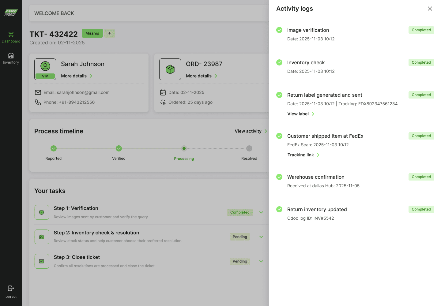
The portal remembers. So the agent doesn't have to.
Take 6: One small pushback on the AI section.
The client wanted a dedicated AI section in the portal; a separate module where agents could interact with ChatGPT to draft responses.
I pushed back.
AI had one job here: help agents write replies faster. So instead of a separate section, it became a single "Generate Response" button inside the chat panel itself. Where the reply already happens. No extra navigation, no context-switching.
THE LESSON HERE
When a feature has one job, give it one button. A dedicated AI section would have felt important but added friction. The button inside the chat just works.
The final portal looks like.
Eight resolution flows. One framework. Every flow, wrong delivery, lost shipment, simple return, ride-or-return, ETA request, fitment help, partial refund, co-pilot response built on the same guided structure. Agents learn the pattern once. Then it works everywhere.
What no longer exists.
The best way to measure this portal isn't what it added. It's what it removed.
❌ Opening 5 tools to resolve one ticket
❌ Figuring out which resolution flow applies to which complaint
❌ Skipping verification because nothing enforced the order
❌ Switching tabs to check inventory during a resolution step
❌ Manual warehouse selection under pressure
❌ Calculating return eligibility from order dates every time
❌ Copy-pasting AI replies from a separate tool
❌ Starting from scratch on a ticket that changed hands
How it landed.
The portal went into a single client review. No structural revisions. No going back to the drawing board. The client saw it and said yes.
"The designs captured exactly what we needed. A system that thinks for the agent, not the other way around."
Rajat Malhotra, Project Owner, Zafco International LLC
What I took away from this.
The most important thing I learned on this project is that the hardest UX problems are never about the interface. They're about the system underneath it.
Every screen I designed was straightforward. The complexity was in understanding the logic what triggers what, what has to happen before what, what the agent is actually thinking at each step. Getting that right made the interface almost write itself.
The second thing: when you design for the worst-case scenario, the most complex ticket, the most overwhelmed agent, the busiest moment of the day then the good cases take care of themselves. Simple tickets were already manageable. This portal was built for the hard ones. And the harder the case, the more the guided structure pays off.
And the third thing, which sounds obvious but isn't: the best tool is one that the user doesn't have to think about. The portal doesn't ask agents to adapt to it. It adapts to them. That was the whole point.
year
2025
timeframe
15 days
tools
Figma | Claude
category
SAAS
see also


