Simplilearn
Transforming Discovery for 2M+ Monthly Users at Simplilearn
00

Simplilearn is one of the largest online learning platforms in the world. Think certifications, upskilling programs, postgraduate courses in partnership with universities like Caltech, Purdue, and IITs. The kind of platform you go to when you're serious about moving up in your career.
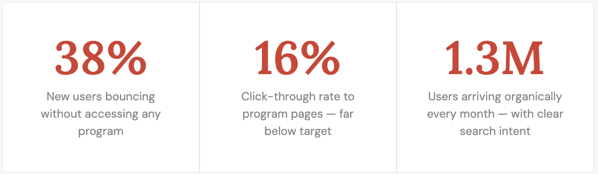
2 million users a month land on their homepage. That's not a small number. And a significant chunk of them over 1.3 million arrive organically, searching for keywords like "data science course" or "cybersecurity certification." They come with intent.
And then they bounce.
That was the problem I was brought in to solve.
The assumption in the room.
When I joined the project, the hypothesis was already set. The homepage wasn't visually compelling enough. Users land, don't feel engaged, leave. Fix the design, fix the bounce rate.
It's a reasonable assumption. It's also wrong.
I went into research with one question: what do users actually expect when they land on this page? Not what we thought they expected. What they actually came looking for.
Users weren't leaving because the page looked bad. They were leaving because the page didn't match what they came to find.
THE REAL PROBLEM STATEMENT
New and organic users landing on the homepage have a high bounce rate and low CTR to program pages because the page is forcing every type of user through a single, generic discovery experience that matches none of their mental models.
What research actually found.
Three research objectives going in: who are these users, how are they interacting with the page, and what do they actually want?
The answer wasn't one user. It was four.
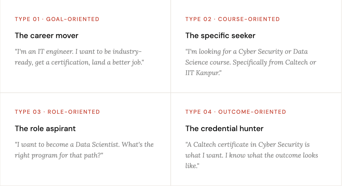
Four completely different starting points. Four different questions the page needed to answer. And one homepage trying and failing to answer all of them at once, with the same layout, the same content hierarchy, and the same generic CTA.
One size fits all? Not here.
THE ACTUAL INSIGHT
The problem wasn't that the page looked generic. It was that it thought generically. It assumed every user had the same starting point. They don't and no amount of visual polish fixes a mismatch in mental models.
So how do you design for four people at once?
You don't pick one and ignore the rest. You design the page so each person finds their entry point quickly, naturally, without having to work for it.
The how-might-we that guided everything:
Make program discovery work with the user's mental model, not against it
Make the content relatable and specific, not generic
Build enough trust that users feel confident choosing Simplilearn over competitors
Use real user stories to match what each type of user is actually imagining for themselves
That's the brief. Now the decisions.
Designing the page.
Take 1: Make the content feel like it was written for this user.
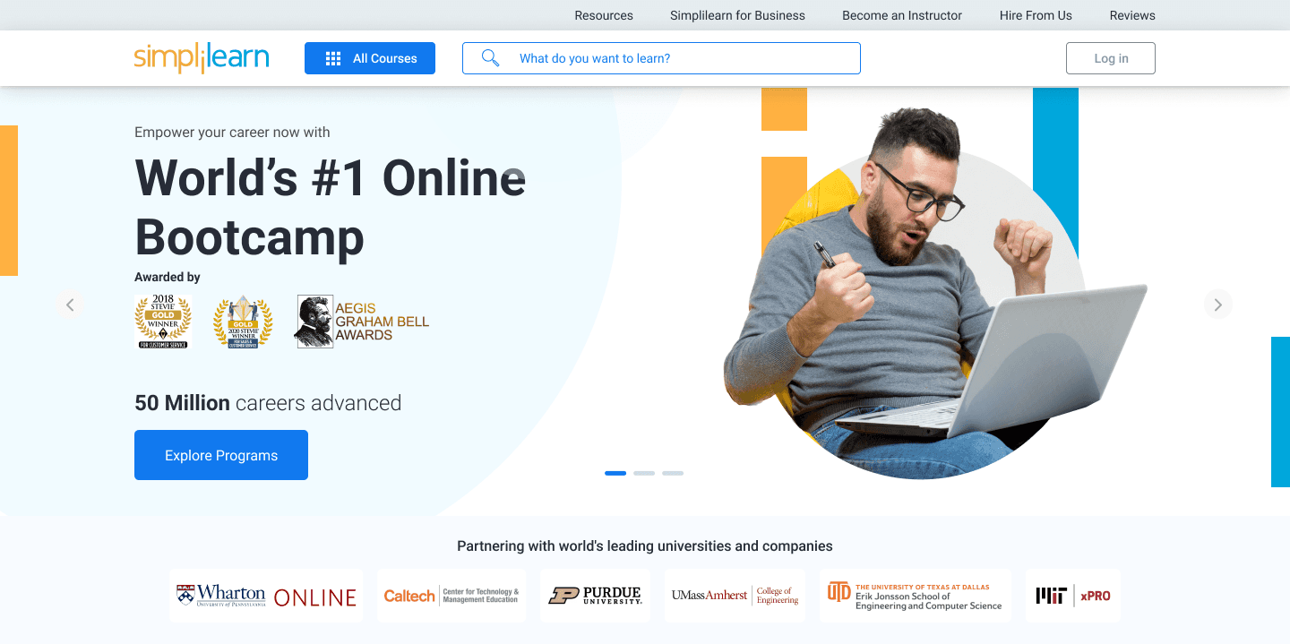
The old homepage used safe, category-level language. "Explore our programs." "Learn from the best." The kind of copy that works for everyone and connects with no one.
The first decision: replace generic headlines with language that mirrors how each user type actually thinks about their situation. Not the course name the outcome. Not "Cyber Security Program" "Get certified. Get hired. Stay ahead."
Paired with imagery that showed people in the professions users were aspiring to not stock photo classrooms. Real context. Real relatability.
WHY THIS MATTERS FOR AN EDTECH PLATFORM
Buying a course is a high-stakes decision. Users aren't picking a Netflix show they're investing months and money into a career move. They need to see themselves in the outcome before they'll read another line. The imagery and copy does that work in the first 3 seconds.
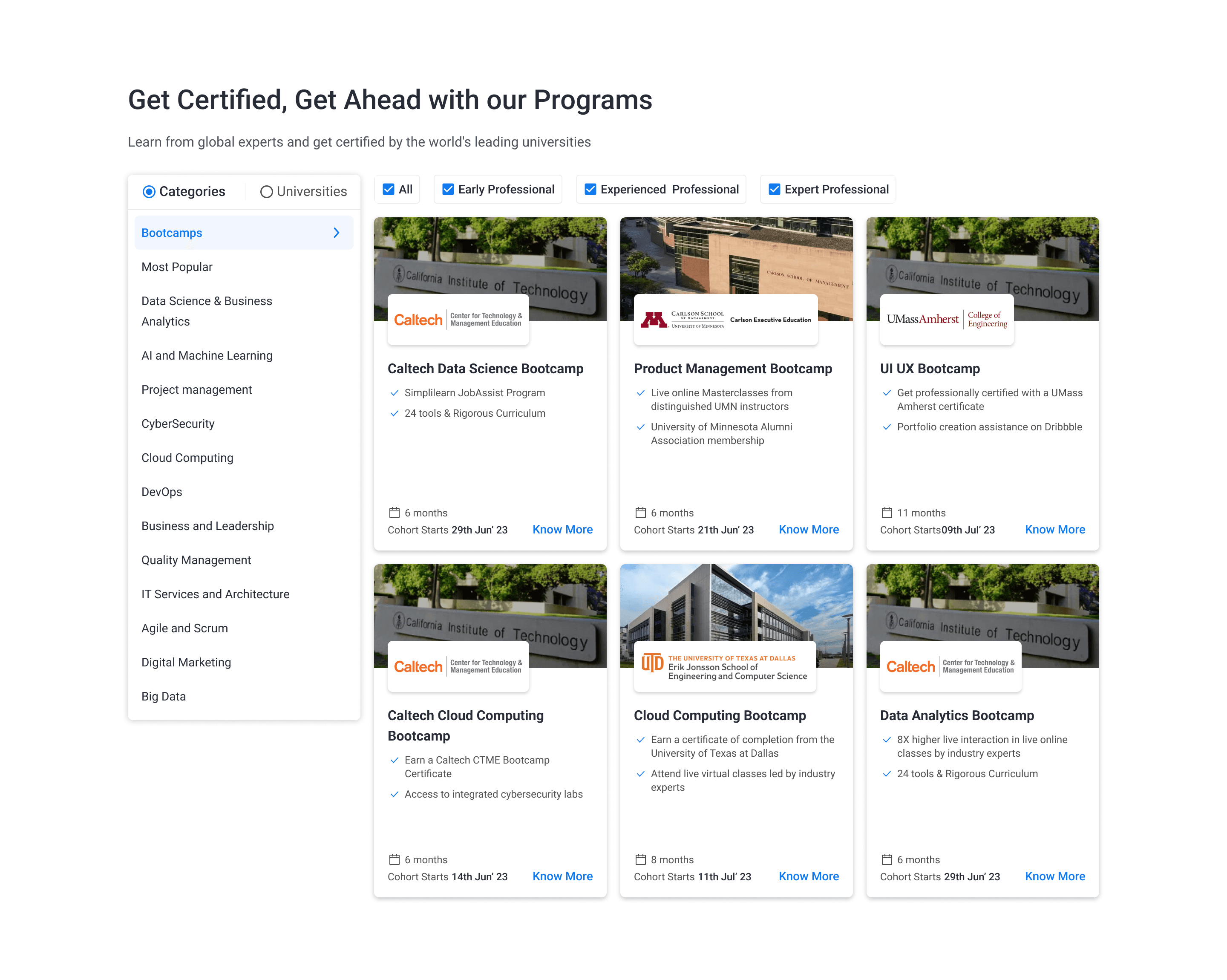
Take 2: Build a discovery path that matches how users actually think.
The course-oriented user arrives knowing what they want. "Data Science, Caltech, 6 months." They need to find it fast without navigating a flat list of 200 courses.
The outcome-oriented user arrives knowing the credential they want. They need to find which program gives them that, and why Simplilearn's version is the right one.
Both are searching. But they're searching differently.
The solution: a redesigned discovery section that lets users filter by what they're looking for by goal, by course, by role, by university rather than browsing through what Simplilearn has decided to surface. Clear category differentiation. University partners called out explicitly. The hierarchy shifts from what we want to show to what the user came to find.
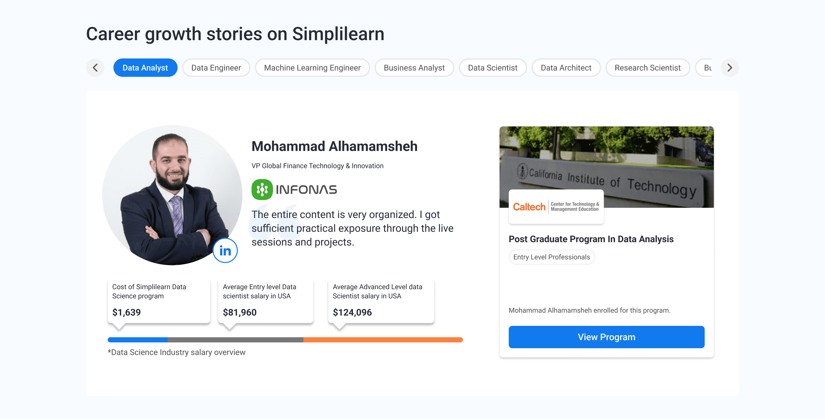
Take 3: Give the goal-oriented and role-oriented users a story to follow.
The career mover and the role aspirant aren't looking for a course. They're looking for proof that this works. Did someone like me do this? Did it actually lead somewhere?
User stories, real people, real transitions, real outcomes, became a core section of the redesigned page. Not testimonials in the traditional sense. Structured mini-narratives: where they started, what they did, where they ended up.
The goal-oriented user sees someone who was an IT associate and is now a certified cloud architect. The role aspirant sees someone who became a Data Science team lead in 8 months. Both stop scrolling. Both keep reading.
Take 4: One more layer where the user is from.
Simplilearn operates across India and internationally. And what matters to a user in Bangalore is different from what matters to a user in Mumbai different universities carry different weight, different peer groups create different social proof.
Geo-specific optimization was added as the final layer. Users see programs that are popular in their region, reviews from learners nearby, and local university partnerships called out. It's a small change in logic. It's a significant change in relevance.
THE PRINCIPLE HERE
Trust is built faster when things feel familiar. A learner in Delhi seeing that 4,000 people from Delhi completed this program is more convincing than any global statistic. Proximity creates credibility.
What happened after.
The redesign went live. Within the first month:
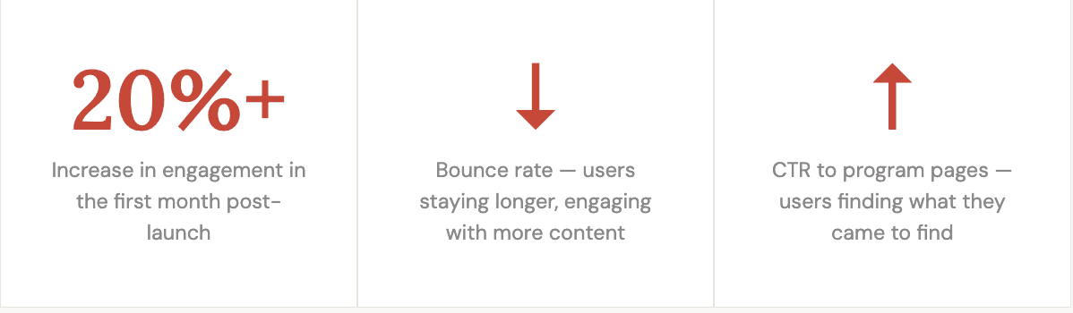
More than anything, the metric that mattered was simpler than the numbers: users were finding their way to program pages. They were arriving with intent and leaving with a destination. The page stopped being a wall and started being an entry point.
What I took away from this.
The biggest lesson from Simplilearn is that the most dangerous assumption in design is a shared one. Everyone in the room believed the problem was visual. That assumption felt safe because it was confident. And it was completely wrong.
Research didn't just uncover a different answer. It reframed the entire question. We stopped asking "how do we make this page look better?" and started asking "how do we make this page work for four completely different people?" Those are not the same question, and they don't lead to the same solution.
The second thing: homepage design for a product like Simplilearn is harder than it looks because the homepage isn't one thing it's four landing pages stacked into one URL. Every user type needs their own entry point, their own content hook, their own path forward. The design challenge isn't making one great page. It's making one page that feels like the right page to every person who lands on it.
That's a different kind of problem. And it's exactly the kind I like working on.
year
2023
timeframe
21 days
tools
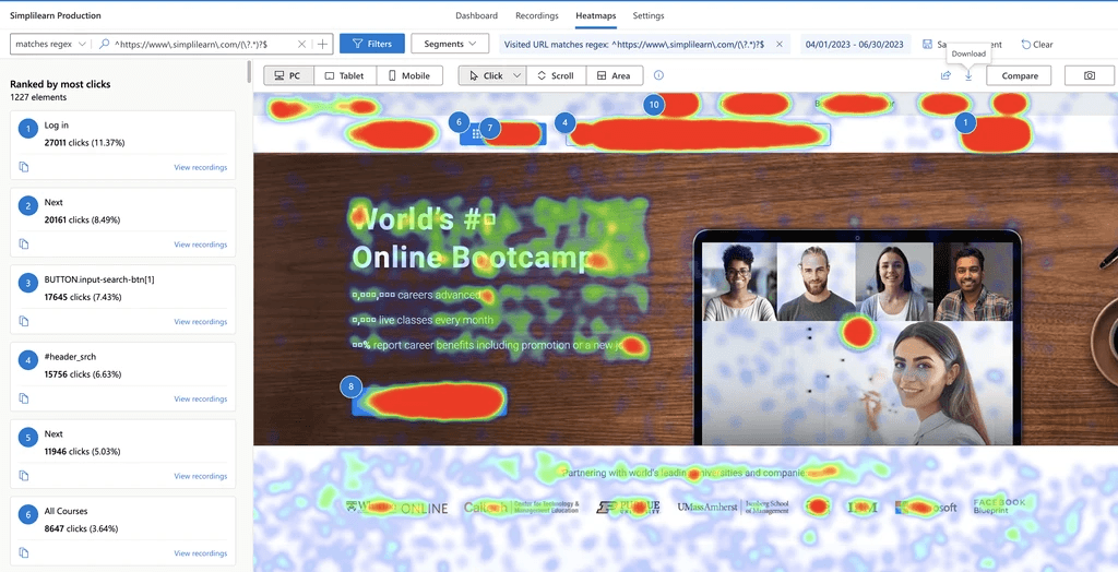
Figma | Tableu | Clarity
category
UX/UI
see also


